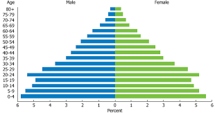
Today, in class, we discussed what home-schooling is like with the shadow that was in our class and shadowing today. Most of the class bombarded him with questions. Now to your regularly scheduled program, Human geography with Mr. Schick.Population Pyramids... there are used to analyze growth or the decrease of growth in a nations population. These pyramids can measure growth, the decrease in growth, fertility, mortality, and migration in cities. On these special pyramids, the male humans are always on the left and the female humans are always opposite to that. There are three basic/common types of these population pyramids. The Christmas Tree, The Box, and The Cup. The Christmas tree chart is shown at the top right hand corner of this blog. It shows that it is a developing nation, the growth rate is slow, it's birth-rate is very high, these people have a short life expectancy. Some examples of nations that have these charts are Namibia and Bangladesh. The Box chart is shown below this text (based in France). The Box chart represents a developed nation. The nations with a low infant mortality, a slow population, and have a long life expectancy. Examples of the Box chart are Sweden and the United States of America. The Cup chart is located to the bottom right of this very blog. The Cup chart represents a developed nation; negative growth. The nations usually tend to have a low birthrate, they have a shrinking population, and they usually have a long life expectancy.


No comments:
Post a Comment